A new approach to naming design tokens
The research and insights I've collected over the last 6 months provide the foundations for a new approach to naming design tokens based on the current tools and technologies available to us.
It's confession time.
I've been mildly obsessing about naming design tokens for almost a year now. 🙈 This obsession turned into a research project, and now I'm about to propose a new approach to naming design tokens, which goes against what people assume are best practices. I'm kind of afraid of the backlash, but my desire to help the community is stronger. 🙃
I'm so grateful to Sil and the Into Design Systems Conference for giving me a platform to share this information with the design systems community!
I touched on this research in an interview with Sil about my "How to name Design Tokens" workshop coming up in just a couple of weeks. Seeing as I won't have time to go into it during the conference, here's the information that is fuelling my new approach to naming design tokens.
👀 Check out the video interview between Sil and I on YouTube.
The research and context
It started as a curiosity of mine. I noticed more folks in the Tokens Studio community having trouble understanding each other when chatting about their systems.
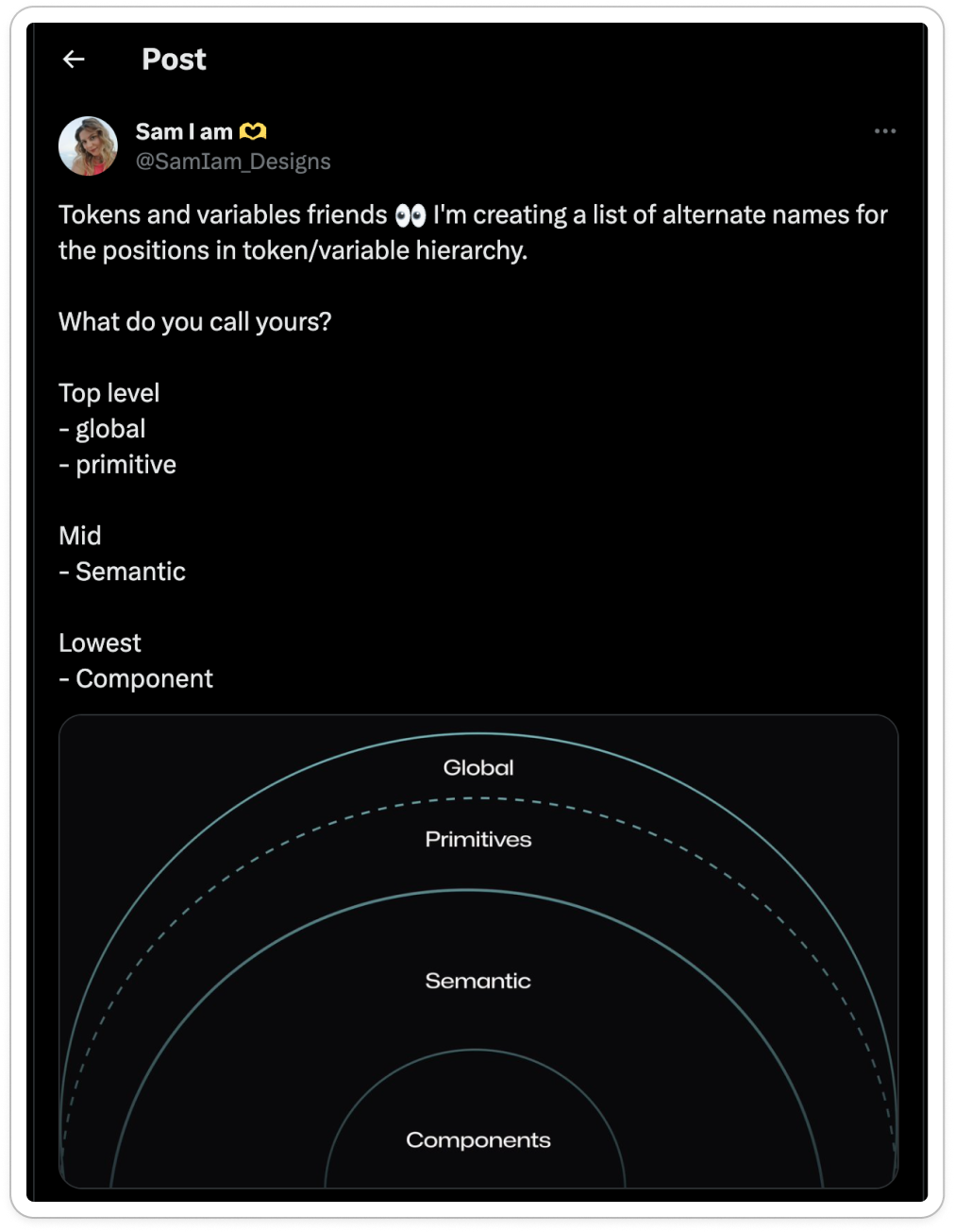
Words like global, system, semantic, primitive, variables, and themes all seem to be suddenly used interchangeably when talking about the same thing. But in my mind, these labels represented very specific and different concepts in the world of design tokens.
So I made a (shitty) infographic to try and illustrate my question to the community, and I posted it on Twitter and LinkedIn.
I wanted to compile all the popular names for the different parts of our token structure.
It went viral (as far as a post in the design systems community can go) with over 60,000 impressions across the two platforms, and around 50 people contributed to the conversation. 🤯
If each "impression" counts as an average of 1 minute of time spent thinking about this topic, it signals to me that as a community, we spend a LOT of collective time and energy thinking and disagreeing about how to name our tokens.
I already knew we had a naming problem, but I didn't realize it was this hot of a topic.
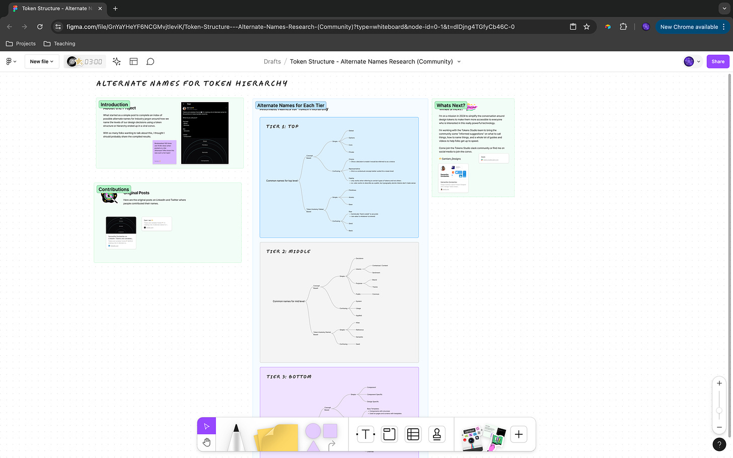
I compiled the research in Airtable then created a mind map FigJam. There is an average of 8 different names used to describe each "tier" in our design decision structure, which we typically tokenize.
👀 Check out the Figjam file of the compiled research here
I thought to myself, if we can't agree on a standardized way of explaining our design decisions as experts and long-time design token enthusiasts, how are new people supposed to figure it out?
If we are spending this much of our collective time and talent all doing the same thing in different ways, how will we ever buy back our time so we can move on to bigger and better things to think about?
This was the beginning of a six-month rabbit hole of researching how designers are naming their tokens.
I started to see some themes in the problems we are facing as designers, and now I'm on a mission to solve them.
This isn't the only/best way; it's an informed suggestion that you can have in your toolbox to try when it makes sense to.
My hope is that, as a community, we can start to align on a common language and method of naming so we can spend the next 60000 moments of energy working on the next innovation or cool thing instead of debating on "how to name your semantic design decisions" or "do I need component tokens."
Token structure
For simplicity, I'm going to use the easiest words possible to describe the layers of information in our design system. I think about this as tiers of design decisions captured as design tokens.
Once we understand token structure, we can start to think about how to be thoughtful with token names, which allows us to solve many of the challenges we have when scaling our design systems to help our brands, clients, and products evolve faster.
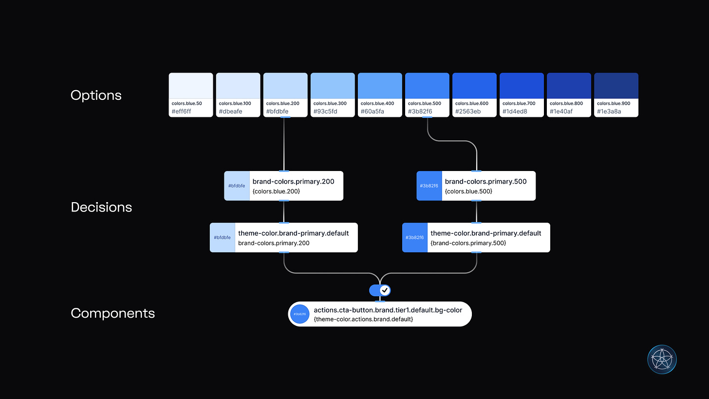
Tier 1 - Options
When working on a project, these are the options I have to choose from.
These tokens represent the primitive decisions in my design system.
Looking at color, each step in a color scale is an option I have to choose from:
Example:
colors.blue.500
Tier 2 - Decisions
Once I start to narrow down my options and make some decisions about how I intend things to work in my system.
These tokens provide meaningful context about my intentions.
Looking at color, giving a token from elsewhere in my structure a new name, or alias to communicate my decision:
Example:
brand-colors.primary.default
Tier 3 - Components
Once I build components styled with tokens from the decisions I've made, I can create component specific tokens to be shared with engineers in code.
These tokens tell the system where and when to use my decision tokens in a way that provides a foundation for a more automated design to development process.
Looking at color, writing a token name that tells the system which component, interaction state, and attribute without describing the value of the decision means once the component is built, the token name should never have to change:
Ex:
actions.cta-button.hover.bg-color
Problems to solve
Naming is hard.
There are entire Slack community channels on the topic, but there are very few credible resources on how to approach it. Because there are no official web standards for naming tokens, and we clearly haven't aligned as a community, naming feels complex and technical when getting started.
When you do find a resource on how to name design tokens (and there aren't that many out there), the authors have specific methods, informed by the limited number of projects they have worked on that use tokens. However, these methods may not work for your system, or they could be too technical or confusing for your team to adopt when they are just getting started.
Naming tokens feels like a lot of work.
Many designers I've spoken with will try to create as few tokens as possible because naming them feels like a black hole of creative energy.
They would rather blindly follow what someone else said to do in a Medium article from 5 years ago than come up with their own token naming template because they have no idea how to approach it, and they don't have the time or capacity to figure it out.
As soon as they figure out token names are the IDs of their design decisions used in code, the pressure to perform with perfection feels almost unmanageable. Github is scary; working with engineers on anything resembling code is scary, and making a mistake feels terrifying.
Token names are long, and we have a real estate problem.
In our design tools, when names are long, they get truncated. Working in Figma, you might see only the first or last part of a token name when it’s attached to a style or variable.
Look at this token name and try to guess what decision it represents.
md-sys-sem-c...
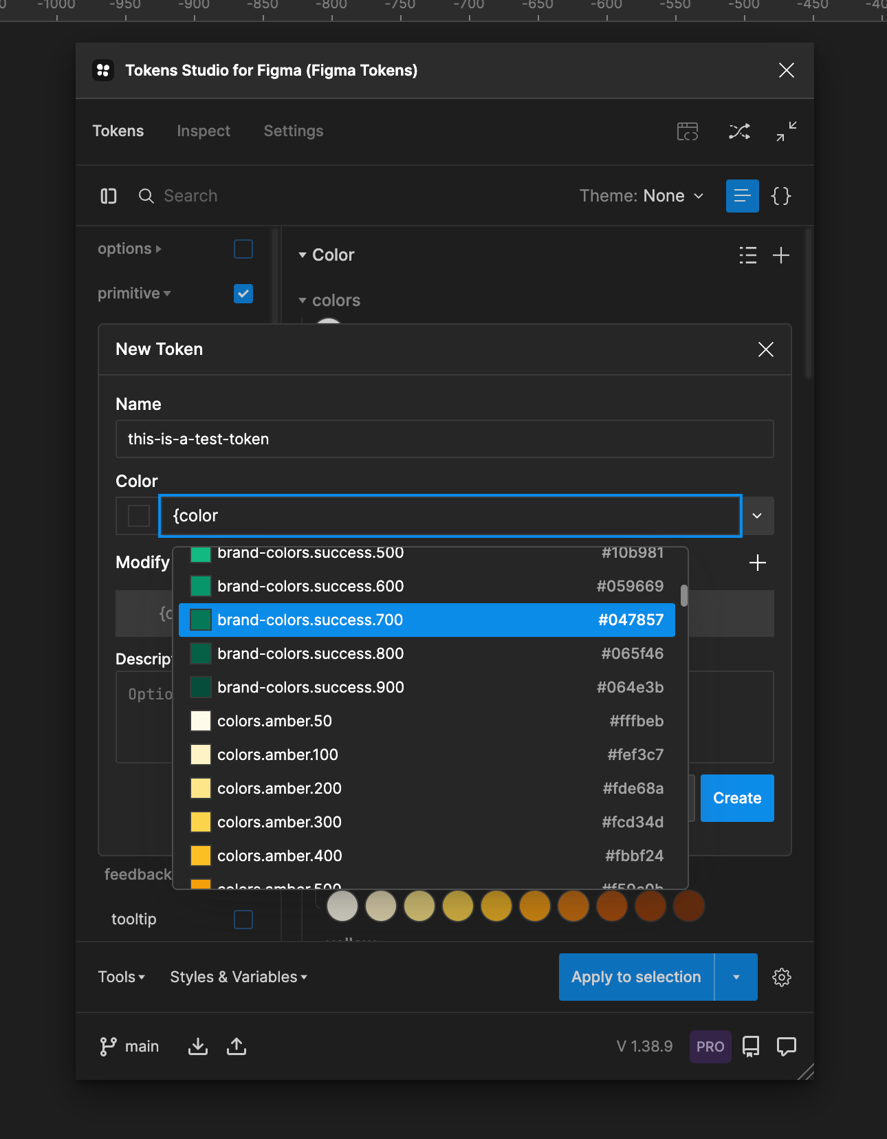
If you searched you system for "color" and saw these results, would you be able to find the right token to use for the component you are working on?
md-sys-sem-c...md-sys-sem-c...md-sys-comp-...
This "front matter" is taking up all the real estate in the viewing experience of our token names! When I asked designers why they have their names written in this way, they tell me, "I was told to do it this way by my engineers," "we saw it in an article," or "this company does it this way in a talk I watched".
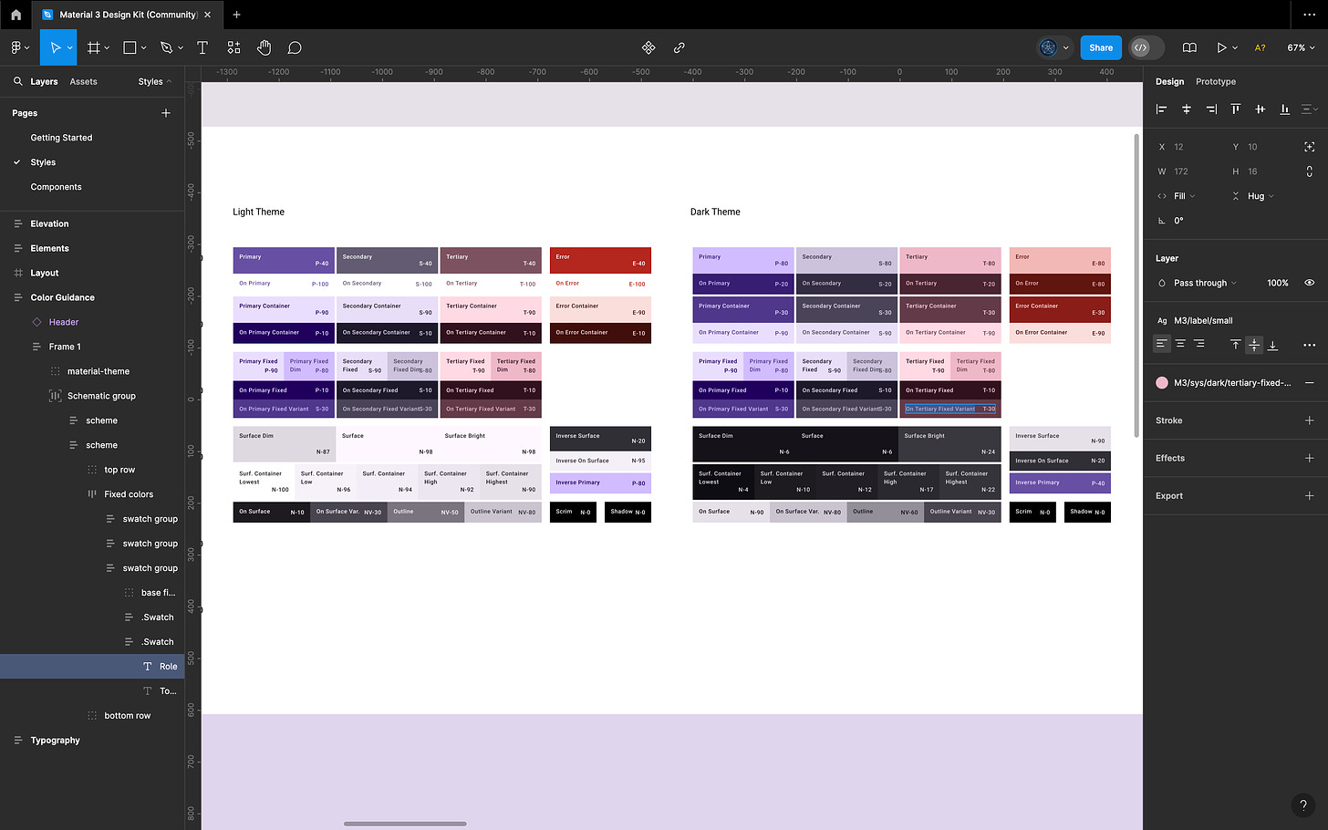
This is a screenshot of the Material Design Figma community file for their color token names. You can see in the right side of the design panel the truncated long name that is quite complex and technical to begin with M3/sys/dark/tertiary-fixed-... is what we can see in our design tooling.
Less tokens = higher performance with less maintenance cost
The term "token bloat" is used to describe token structures with too many tokens that are not adding value to the system and negatively impacting the performance of the system.
Token bloat has become a term people associate with other problem statements like:
The more tokens I have, the harder it is to understand the design system and find what I am looking for.
The more tokens I have, the more work it is to maintain my system.
If a token can only be used once, it is not worth the effort to create and maintain it.
While token bloat is a real problem that can happen when you are first figuring things out, the perceived consequences of a high number of tokens are technically inaccurate.
As I dug into these things a little deeper, I realized most of the associated challenges with managing lots of tokens actually have to do with poor token structure and naming practices impacting the user experience of people working with the tokens and have less to do with performance issues of the system consuming the tokens in code.
The truth is...
As designers working with tokens, we've inherited some bad habits that are causing a lot of these problems.
We picked these up based on what used to be necessary best practices based on the limitations of the tools and technology.
The good news is, design tokens are still relatively new, and the technology is changing fast! There have been many improvements in the tools and processes we have access to, which will help us solve a lot of the problems we just discussed. I will propose a new approach to naming tokens based on how things are working under the hood, which should simplify the process.
For technical accuracy, I consulted with the engineers working on Tokens Studio and Style Dictionary, as well as many other engineers consuming open-sourced tokens I've created using this format with positive feedback.
Token names are modified by engineers
Once our tokens are shared with engineers, they use a tool like Style Dictionary to transform design tokens from their platform-agnostic format into whatever programming needs are required to use design tokens in code.
This is known as the transformation part of the design-to-development process with design tokens.
All token names are modified during the transformation stage according to the engineering preferences.
Most common token name modifications:
Change casing and punctuation
Flatten them to remove groups
Add or remove front matter/prefixes
Remove designer-specific words
These name modifications are easy for engineers to perform with just a few lines of code. If adding information to a name is easy for engineers to do in their tooling, why are designers still suffering from truncated names in their tooling, which makes their work more difficult every day?
Let's remove the namespace and system ID from token names
The truth is, we don't have to include things like namespace or system identification codes in our token names on the design side. Engineers can easily add that in when the tokens are transformed on their side if they want it there.
So instead of a search result for color looking like:
md-sys-sem-color-brand-primary-default...md-sys-sem-color-theme-bg-emphasis...md-sys-comp-color-icon-button-background-default
If we front-load our design tokens with helpful context about where these decisions sit in our token structure, we can optimize the designer experience working with the tokens without negatively impacting the engineering experience.
Our search result for color could look like:
colors.blue.500brand-color.primary.defaulttheme-color.bg.emphasiscta-button.brand-tier1.hover.bg-color
Even if these names are truncated, I can tell by the first part of the token name where, in my system, each decision is intended to be applied. This has a massive positive benefit in the designer workflow, saving a ton of time and allowing for better navigation of design decisions within complex token structures.
When there is no system-related front matter, it's much easier to find what we are looking for, even in a token system with hundreds of color tokens.
Token anatomy has changed
Today, the Design Tokens Community Group, which manages the W3C specifications of design tokens, identifies these atomic parts of a design token:
Name
Value
Type
Description (optional)
Did you know when design tokens were first making their way into the world, they only consisted of their name and value?
This is why so many of us who have been using tokens from the start will start a token name with the design property the token represents.
The front matter of color in the token name would help the engineers and system tools to use the token to apply a color property to my design element. When all the tokens are in a long list, keeping things consistent really helped the engineers and the system stay organized, all color tokens could be grouped together by their name.
Now with the new addition of token type as a property, having the property at the beginning of the name in a very consistent place for all tokens is not a requirement. Engineers can group, sort, or filter by token type!
Let's front-load names with where they sit in the system
The truth is, having the same token name format for every part of our token structure adds to our confusion.
Recalling that each tier of our token structure represents different design decisions with different use cases and purposes in our system, let's write token names that are optimized for that!
The old way:
md-sys-sem-color-brand-primary-default...md-sys-sem-color-theme-bg-emphasis...md-sys-comp-color-icon-button-background-default
Compared to the new way:
colors.blue.500brand-color.primary.defaulttheme-color.bg.emphasiscta-button.brand-tier1.hover.bg-color
Primitive options can start with the property. This makes them easy to identify! I also can choose not to publish or share tokens, starting with properties for other designers to minimize the number of tokens they have access to.
colors.blue.500
Decisions we make which alias another token can start with the category of decision they apply to. When I look at these tokens, I know exactly where these decisions came from in my system. When I publish these for other designers to consume, they can easily tell which tokens they need for the work they are doing.
brand-color.primary.defaulttheme-color.bg.emphasis
Components can have names that start with the name of the component or group of components. This makes it obvious to engineers and system tools exactly where and when these decisions apply, and I can choose not to publish tokens starting with component names in my design tools with ease.
cta-button.brand-tier1.hover.bg-colorfeedback.notification.success.default.fg-color
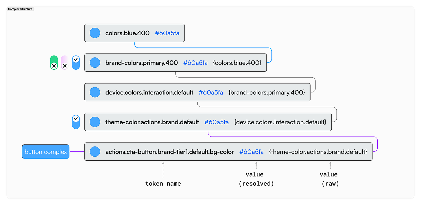
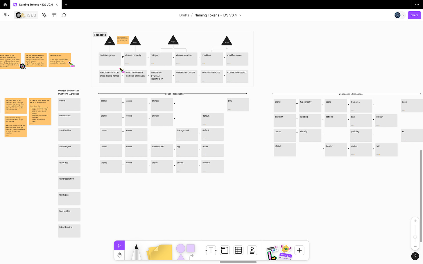
Here's an example of a button component's background color token. By looking at the name of the token and the value that references another token, we can easily follow our design decisions regarding our token structure. At a glance, I can understand the who, what, where, when, why and how of our design decisions.
Designers are over-engineering their token structure
Working with Tokens Studio I have seen a LOT of token structures. As systems get more complex and start to support multiple brands, themes, platforms and devices with unique design requirements, the structure can start to get very confusing, especially for an outsider looking in to try and help.
Once I change the front matter of tokens in the decision tier of the token structure and I can start to see where the information is flowing through the system, I still see systems that are way more complex than they need to be.
When we start to peel back the layers, there are many different contributing factors:
I inherited this system, and I don't know any other way.
I tried it this way; it worked with Tokens, but now, with variables, it doesn't, and I have no idea how I got here.
I'm scared to mess things up by moving or changing things.
All of these factors come from the same root problem. The team can't easily understand the flow of information between the design decisions that form their design token structure. As the system scales, they take a best guess as to what should change to support their growth.
This causes unnecessary duplication of design tokens (bloat), which are all named in the same way, so when we look at a component like a button, it's next to impossible to chase our design decisions through the structure without being the one who made the change.
Let's take an information architecture approach
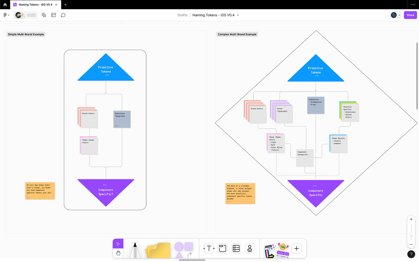
The truth is that our token structure needs a bit of information architecture (IA) as we work on our system. In the same way a website needs to map out its navigation so key content is easy to find according to its users, we can apply the same approach to our token structure.
If you aren't familiar with IA, don't worry! I'm working on a community file to help, which will debut at the Into Design Systems Conference in just a couple of weeks. Here are the key concepts.
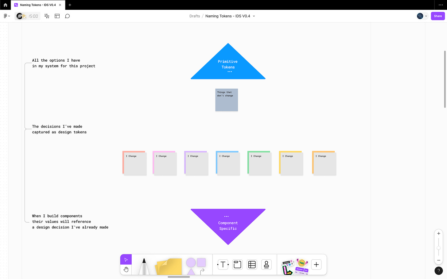
Map out the tiers of your token structure
You can use a spreadsheet, paper and pen, or a drawing/white boarding tool of choice
I'm using Figjam
The decision tier in the middle is where things tend to get complicated, so we will focus our efforts here.
Map out the things that change or have unique design requirements in your system by "theme". Things like:
Color themes light/dark
Brand colors
Map out the things that stay the same regardless of the "theme". It helps to think about a particular component in your mind.
Thinking about that component, move the "messy middle" items in your map around and start to connect them based on the flow of information.
You'll notice the more complex your system is, the more your map will start to take on the shape of a triangle, whereas simple systems tend to look like a column.
Once you are happy with your map, you can talk with your design and engineering teams to come up with intuitive names for the front matter of the token names that live in these sections of your design token structure.
I've been working with the Tokens Studio team to come up with token naming templates to share with the community if you need a place to start or some suggestions to bring to your team! They will be included in the FigJam file I'm sharing after the workshop for the Into Design Systems conference is over.
🔗 There's still a few spots to attend the conference, or you can buy the recordings!
I'm curious to know what you think about this new approach to naming tokens! Feel free to get in touch or tag me in a post with your thoughts!
🔗 Figma Community File - Naming Tokens Template

